| Layout Policies | ||
|---|---|---|
 | Chapter 9. Java™ Graphical User Interface(GUI) Components |  |
| Layout Policies | ||
|---|---|---|
| | Chapter 9. Java™ Graphical User Interface(GUI) Components | |
If we want to position textboxes, buttons and checkboxes on a window like in Figure 9.1, “Example GUI: Font Dialog”, we
need a way to organize these components in the window. A layout policy allows us a way to describe the order that
we want to display these components, allowing a structure for placing these components on the applet. In the last
example we used a 
FlowLayout, as it is the default layout, that just adds the components
to the applet in the order in which you use the 
add() method.
It is possible to change the layout of the components using a layout manager, the most common layouts are:
FlowLayout
GridLayout
BorderLayout
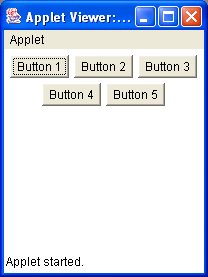
A FlowLayout arranges components left-to-right top-to-bottom, much like the
"centred text" button in Microsoft Word for Windows, where each line is filled and centered until the line
is full. In a flow layout form each component takes its preferred size.
You can see this applet running here -
FlowLayoutApplet.html and the
code segment is here - FlowLayoutApplet.java
 1
 2
 3  import java.awt.*;
 4  import java.applet.Applet;
 5
 6  public class FlowLayoutApplet extends Applet
 7  {
 8      Button button1, button2, button3, button4, button5;
 9
10      public void init()
11      {
12         button1 = new Button("Button 1");
13         button2 = new Button("Button 2");
14         button3 = new Button("Button 3");
15         button4 = new Button("Button 4");
16         button5 = new Button("Button 5");
17         add(button1);
18         add(button2);
19         add(button3);
20         add(button4);
21         add(button5);
22      }
23  }
24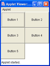
25 A GridLayout lays out the components in a rectangular grid. The container that you apply
the layout to, divides the area into equal sized squares and each component that you add is sized to fit that square. If
you look at Figure 9.10, “A Grid Layout Applet” you will notice that the buttons have been scaled larger to fit the
grid area exactly. This can be difficult to get used to.
You must specify the number of rows and columns in the grid. So to construct a 3x2 grid as in
Figure 9.10, “A Grid Layout Applet” I used new GridLayout(3,2) to construct the 3x2
GridLayout object. If you place a 0 for either the row or the column
value to the constructor then you will have unlimited rows or columns. For example, new GridLayout(0,2)
will construct a GridLayout object with 2 columns, but an unlimited number of rows.
The order that you use the add() method is still important as it adds the components to
the grid from left-to-right top-to-bottom.
You can see this applet running here -
GridLayoutApplet.html and the
code segment is here - GridLayout.java
 1
 2
 3  import java.awt.*;
 4  import java.applet.Applet;
 5
 6  public class GridLayoutApplet extends Applet
 7  {
 8      Button button1, button2, button3, button4, button5;
 9
10      public void init()
11      {
12        this.setLayout(new GridLayout(3,2));
13        button1 = new Button("Button 1");
14        button2 = new Button("Button 2");
15        button3 = new Button("Button 3");
16        button4 = new Button("Button 4");
17        button5 = new Button("Button 5");
18        add(button1);
19        add(button2);
20        add(button3);
21        add(button4);
22        add(button5);
23      }
24  }
25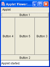
26 A BorderLayout arranges a container into five regions, North, South, East, West and
Center. Each region can have either one or zero components. If you do not place a component in the region then it
will not be displayed. When we are adding components to a container we could write something like:
 Button testButton = new Button("Test Button");
 this.add("North", testButton);

 //or using add in another way

 Button testButton = new Button("Test Button");
 this.add(testButton, BorderLayout.NORTH);
When you add a component to the BorderLayout the components are added according to
the components preferred size and the BorderLayout's preferred size. For Example as in
Figure 9.11, “A Border Layout Applet”, a button added to the North will have the preferred height of
the Button object, but it will have the preferred width of
the BorderLayout container area. If you look at Figure 9.11, “A Border Layout Applet” you will
also notice that the "Button 3" object has its preferred width of the Button object, but it
has the preferred height of the "West" region of the BorderLayout container area.
You can see this applet running here -
BorderLayoutApplet.html and the
code segment is here - BorderLayout.java
 1
 2
 3  import java.awt.*;
 4  import java.applet.Applet;
 5
 6  public class BorderLayoutApplet extends Applet
 7  {
 8      Button button1, button2, button3, button4, button5;
 9
10      public void init()
11      {
12        this.setLayout(new BorderLayout());
13        button1 = new Button("Button 1");
14        button2 = new Button("Button 2");
15        button3 = new Button("Button 3");
16        button4 = new Button("Button 4");
17        button5 = new Button("Button 5");
18        add("North",button1);
19        add("South",button2);
20        add("East",button3);
21        add("West",button4);
22        add("Center",button5);
23      }
24  }
25
26
There is one other Layout Manager that is commonly used - the GridBagLayout. It allows
components to be aligned vertically and horizonatally without requiring the components to be the same size. You can
see more information on this Layout Manager in the Java API documentation under java.awt.GridBagLayout.
A Panel is the simplest form of container. A container is a component that
can contain further components, or even other panels. The default layout for a
Panel is the FlowLayout. Using Panel
components allows us to develop quite advanced layouts as we can embed layouts within layouts. You can
create a Panel object using:
	Panel p = new Panel();		//for a simple panel

	//or

	Panel P = new Panel(new BorderLayout()); //change the layout
© 2006
Dr. Derek Molloy (DCU).
| |  | |
| AWT Components |  | A Layout Exercise |