| Developing with Swing | ||
|---|---|---|
 | Chapter 12. Swing - Lightweight Components |  |
| Developing with Swing | ||
|---|---|---|
| | Chapter 12. Swing - Lightweight Components | |
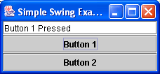
To write a simple Swing application we do not have to make too many changes to a standard AWT application. Figure 12.3, “A Simple Swing Application” shows a simple Swing button application, that should provide you with a template for writing your own applications.
Ths source code for this application is below and in
SimpleSwingApplication.java.
1
2
3 // A Simple Swing Application
4
5 import javax.swing.*;
6 import java.awt.*;
7 import java.awt.event.*;
8
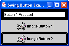
9 public class SimpleSwingApplication extends JFrame implements ActionListener
10 {
11
12 private JButton button1, button2;
13 private JTextField status;
14
15 public SimpleSwingApplication()
16 {
17 // call the parent class constructor - sets the frame title
18 super("Simple Swing Example");
19
20 this.status = new JTextField(20);
21 this.button1 = new JButton("Button 1");
22 this.button2 = new JButton("Button 2");
23
24 this.button1.addActionListener(this);
25 this.button2.addActionListener(this);
26
27 // default layout is border layout for frame/jframe
28 this.getContentPane().add("North",this.status);
29 this.getContentPane().add("Center",this.button1);
30 this.getContentPane().add("South",this.button2);
31
32 this.pack(); //set the size of the frame according
33 //to the component's preferred sizes
34 this.show(); //make the frame visible
35 }
36
37 public void actionPerformed(ActionEvent e)
38 {
39 if (e.getActionCommand().equals("Button 1"))
40 {
41 this.status.setText("Button 1 Pressed");
42 }
43 else if (e.getActionCommand().equals("Button 2"))
44 {
45 status.setText("Button 2 Pressed");
46 }
47 }
48
49 public static void main(String args[])
50 {
51 new SimpleSwingApplication();
52 }
53 }
54
55 You will notice that this application does not shutdown correctly when the x button is pressed on the top left side of the application. This is because we have not written the code to handle this. You can shutdown the application by typing "CTRL-C" in the DOS shell window.
Some points about this application:
It is a full application, not an applet and so extends the 
JFrame
class, the Swing version of Frame (java.awt.Frame) class.
The constructor of this application SimpleSwingApplication
class calls its parent class constructor JFrame, calling the

JFrame(String title) constructor.
he main() method creates an object of the
SimpleSwingApplication by calling new SimpleSwingApplication();
, which creates an anonymous object.
this.getContentPane() returns the Container
object for this JFrame. You cannot add components to the
JFrame directly - you must use the getContentPane()
method call.
this.pack() sets the JFrame object to its
components preferred sizes. this.show() makes the JFrame
object visible on the screen. You usually make this call last as all layout has been carried out
and the frame will not be changing sizes and moving after it is displayed.
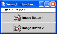
As previously discussed, Swing brings a huge range of components to the Java programming language. Many of the components we discussed previously remain much the same. So for example:
The JButton class replaces the java.awt.Button AWT class
and has much the same functionality, with minor differences. For example we can add an image icon to the
button surface using the following code:
	Image theImage1 = this.getToolkit().getImage("ok.gif");
	ImageIcon i1 = new ImageIcon(theImage1);
	b1 = new JButton(i1);
Where 
theImage1 is a regular Image object and the
ImageIcon takes an Image object as a constructor parameter to
allow of the creation of a component based image display, i.e. one that could be added to a layout or any
container etc. Once we have created this ImageIcon object we can pass this to the
constructor of JButton to create a button with an image display. This can be
seen as in Figure 12.4, “A Swing Image Button Example”. The source code for this example is here -
SwingImageButton.java
You will notice that I changed the code in the actionPerformed() method from
e.getActionCommand() to e.getSource(). If there is no text
on a button, if it was just an image button then there would be no action command (by default) to compare to. It
is better in this application to compare to the source of the event, i.e. the object reference. You will however
have to insure that your object references are made available to the actionPerformed()
method, so should probably be private states of the class.
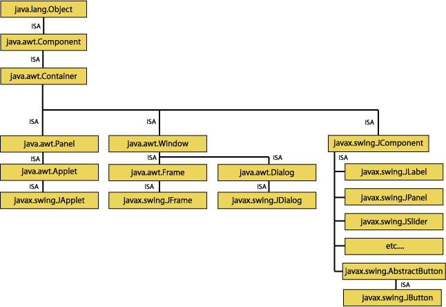
Figure 12.5, “The Swing Component Hierarchy” displays a sample of the Swing Component Hierarchy. This is only a subset of
the Swing components that are available for use. You can see in this figure that JApplet,
JFrame, JDialog and JComponent are replacements
for their equivalent AWT components. JFrame is actually a heavyweight component, it will have
a different appearance depending on the Operating System it is running on.
The Swing equivalent components for the AWT components that we have discussed previously are:
JButton - as discussed replaces the AWT Button and has a
few changes. For one as in Figure 12.5, “The Swing Component Hierarchy” the parent class is AbstractButton
which defines a common behaviour for all buttons, for example there is a two-state JToggleButton
class also inheriting from AbstractButton. Button objects can also
have an image icon added to the button area.
JTextField - replaces the TextField class and remains
esentially the same. There is a slight difference in the event structure and we have the added benefit of some
derived subclasses, such as JPasswordField which allows a password to be entered using
a character mask, and JFormattedTextField to allow for the entry of formatted text, such
as a date of birth.
JTextArea - replaces the TextArea class and is slightly
different. For one thing, the JTextArea does not handle scrolling of the text to allow
you to have more control over its functionality. To add a scrolling capability to a JTextArea
component you can add it to a JScrollPane component. By default, the line wrapping property is set
to false. You can enable line wrapping by using the setWrapStyleWord() method that requires
a boolean value, where true means wrap at word boundaries and false
means wrap at character boundaries (could be mid-word).
JPanel - replaces the Panel class and remains much the
same
JRadioButton - replaces the RadioButton component and has the added
facility of adding an ImageIcon to it. Again you use this with a ButtonGroup object to
create a group of buttons where only one may be selected at a time.
JCheckBox - replaces the CheckBox component. It is actually
a child of the AbstractButton class (as is JButton). As such, you
can add an ImageIcon object. Other operation remains the same.
JComboBox - is the Swing implementation of ComboBox, a
combination of a text field and drop-down list that lets the user either type in a value or select it from a
list that is displayed when the user asks for it. The editing capability can also be disabled so that
the JComboBox acts only as a drop down list.
JList - is the replacement for List. Simiarly to the
JTextArea you have to add the component to a JScrollPane to enable
scrolling on this component. The items in the list can be changed dynamically at run-time and the component has
a special listener swing.event.ListDataListener.
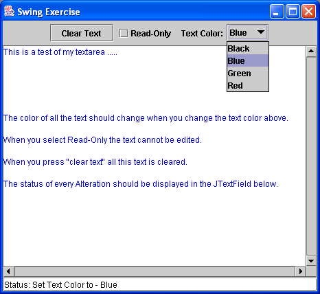
Task: Write the application as shown in Figure 12.6, “A Swing Exercise for You!”, where:
JTextArea component in the center should have the ability
to scroll (with Scrollbars always visible).TextArea for more information.
Hint: Remember to use the API documentation for method calls etc. You will probably have
to use the setForeground(Color c) method to change the text colour of the
TextArea, unless you can work out a better way.
Solution: My solution is here, but please don't look at it until you have had a good
attempt at it - SwingExercise.java
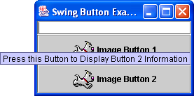
ToolTips can be added to components to allow a further description of the functionality of the component. You can
use the setToolTipText() method of the JComponent class. When you float
over the JButton object the ToolTip will appear as in Figure 12.7, “An Example of Swing ToolTips”.
  this.button1 = new JButton("Image Button 1",icon);
  this.button1.setToolTipText("Press this Button to Display Button 1 Information");
  this.button2 = new JButton("Image Button 2",icon);
  this.button1.setToolTipText("Press this Button to Display Button 2 Information");
Swing also provides borders for JComponent components. 
Border
is an interface that has many default implementations that you can use, or even create your own.
Figure 12.8, “An Example of Swing Borders” shows three different border types that you can use. The JTextField
component is surrounded by a MatteBorder with a colour of black, the first
JButton component is surrounded by an EmptyBorder and the last
JButton component is surrounded by a LineBorder with a line width of
5 pixels, a colour of black and rounded corners set to true. You must import the
javax.swing.border.* package to use these pre-defined borders. The code used for the example
shown in Figure 12.8, “An Example of Swing Borders” is as below:
 1
 2
 3   EmptyBorder eborder = new EmptyBorder(5,5,5,5);
 4   MatteBorder mborder = new MatteBorder(10,10,10,10,Color.black);
 5   LineBorder lborder = new LineBorder(Color.black, 5, true);
 6
 7   this.status = new JTextField(20);
 8   this.status.setBorder(mborder);
 9
10   this.button1 = new JButton("Image Button 1",icon);
11   this.button1.setToolTipText("Press this Button to Display Button 1 Information");
12   this.button1.setBorder(eborder);
13
14   this.button2 = new JButton("Image Button 2",icon);
15   this.button2.setToolTipText("Press this Button to Display Button 2 Information");
16   this.button2.setBorder(lborder);
17
18
The code for both of these examples can be seen in
SwingExtras.java
© 2006
Dr. Derek Molloy (DCU).
| |  | |
| Chapter 12. Swing - Lightweight Components |  | Other Useful Swing Components |