| Toolbars and Multiple Container Classes | ||
|---|---|---|
 | Chapter 12. Swing - Lightweight Components |  |
| Toolbars and Multiple Container Classes | ||
|---|---|---|
| | Chapter 12. Swing - Lightweight Components | |
Toolbars and Menues are containers for components, such as general actions related to an application. In most applications you will have a File menu that allows you to exit, or load a file or print your document etc.
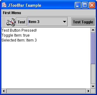
Figure 12.14, “The 
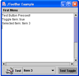
JToolBar Example Application. Toolbar (a) at top (b) at bottom.” shows two views of the same application, where the toolbar is shown
on top in (a) and at the bottom in (b). The toolbar has several components added to it. The first is a
JLabel component with an ImageIcon, the second is a
JButton component, the third is a
JComboBox component with 5 items and finally a JTobbleButton.
The JToolBar object was created and the items added using the following code:
 1
 2
 3 	theToolbar = new JToolBar("My Toolbar");
 4 	theToolbar.setFloatable(true);
 5
 6 	Image theImage = this.getToolkit().getImage("next.gif");
 7 	ImageIcon icon = new ImageIcon(theImage);
 8 	JLabel theLabel = new JLabel(icon);
 9 	theToolbar.add(theLabel);
10
11 	testButton = new JButton("Test");
12 	testButton.addActionListener(this);
13 	theToolbar.add(testButton);
14
15 	String[] items = {"Item 1", "Item 2", "Item 3", "Item 4", "Item 5"};
16 	comboBox = new JComboBox(items);
17 	comboBox.addActionListener(this);
18 	theToolbar.add(comboBox);
19
20 	theToolbar.addSeparator();
21
22 	toggleButton = new JToggleButton("Test Toggle");
23 	toggleButton.addActionListener(this);
24 	theToolbar.add(toggleButton);
25
26 	this.getContentPane().add("North", theToolbar);
27
28
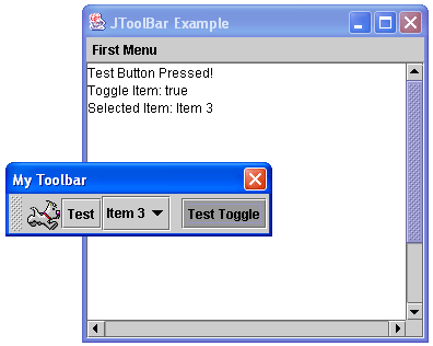
To allow the JToolBar object to be dragged from the top to the sides and to the
bottom, the window container should have a BorderLayout and should not have other
components added to the North, South, East or West.
In the code segment an ActionListener is added to the
JButton object, to the JComboBox object and to the
JToggleButton object. This class implements the 
ActionListener
and so has an 
actionPerformed() method implemented. We will use the
getSource() on the ActionEvent to identify the source
object of the event. A space is added on the toolbar using the addSeperator()
method. This method also allows you to specify the size of gap you require. To add the toolbar to the
window container simply use the add() method, in this case applied to the
Container returned from the JFrame
getContentPane() method.
If you allow the JToolBar to be floatable (using the
JToolBar setFloatable(true) method then the menu bar
can be dragged off the top of the application and can exist as its own window. See
Figure 12.15, “The JToolBar Example with Floating Toolbar” to see this.
The full code for this example is in
JToolbarExample.java
The same application as shown above in the section called “The JToolBar Class” (and source code in
JToolBarExample.java) also
demonstrates the use of the JMenuBar class.
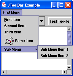
Figure 12.16, “The JMenuBar Example” shows the menu in action. There are four menu items and a
sub-menu with two sub menu items. Notice that the first three items have short-cut keys (or
accelerator keys). The constructors for JMenuItem are:
JMenuItem()Creates a JMenuItem with no set text or icon.JMenuItem(Action a)Creates a menu item whose properties are taken from the specified Action.JMenuItem(Icon icon)Creates a JMenuItem with the specified icon.JMenuItem(String text)Creates a JMenuItem with the specified text.JMenuItem(String text, Icon icon)Creates a JMenuItem with the specified text and icon.JMenuItem(String text, int mnemonic)Creates a JMenuItem with the specified text and keyboard mnemonic.
Each of the JMenuItem objects has had an ActionListener
applied, so when it is selected an ActionEvent object is generated and so our
actionPerformed() method is called and in this case simply displays the
menu item that was selected.
To add the MenuBar to a JFrame, use the
JFrame class setJMenuBar() method (remember to put in
the J as otherwise you would be using the AWT MenuBar and
Frame methods). So you add the JMenuItem objects to the
JMenu object and then you add the JMenu object to the
JMenuBar object which is in turn added to the JFrame
object. To create a sub-menu, as in Figure 12.16, “The JMenuBar Example” simply create a new
JMenu object and add it to a JMenu object (i.e. there is
no special sub menu class).
 1
 2
 3 	JMenuBar menuBar = new JMenuBar();
 4 	JMenu firstMenu = new JMenu("First Menu");
 5 	JMenuItem item1 = new JMenuItem("First Item", KeyEvent.VK_F);
 6 	JMenuItem item2 = new JMenuItem("Second Item", KeyEvent.VK_S);
 7 	JMenuItem item3 = new JMenuItem("Third Item", KeyEvent.VK_T);
 8 	JMenuItem item4 = new JMenuItem("Some Item", icon);
 9 	JMenuItem sub1 = new JMenuItem("Sub Menu Item 1");
10 	JMenuItem sub2 = new JMenuItem("Sub Menu Item 2");
11 	JMenu aSubMenu = new JMenu("Sub Menu");
12 	aSubMenu.add(sub1);
13 	aSubMenu.add(sub2);
14
15 	item1.addActionListener(this);
16 	item2.addActionListener(this);
17 	item3.addActionListener(this);
18 	item4.addActionListener(this);
19 	sub1.addActionListener(this);
20 	sub2.addActionListener(this);
21
22 	menuBar.add(firstMenu);
23 	firstMenu.add(item1);
24 	firstMenu.add(item2);
25 	firstMenu.add(item3);
26 	firstMenu.add(item4);
27 	firstMenu.add(aSubMenu);
28
29 	this.setJMenuBar(menuBar);
30
31
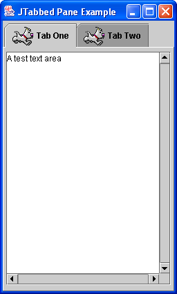
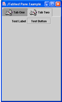
The JTabbedPane class allows the creation of a container that allows several
panels to be added to the one space. Figure 12.17, “The JTabbedPane Example (a) first tab (b) second tab.” shows an example of a
JTabbedPane with two tabs. You can select which container to view by pressing
the tab at the top. To create a JTabbedPane simply use a default constructor:
JTabbedPane tabbedPane = new JTabbedPane();
and then to add tabs to the JTabbedPane use:
tabbedPane.addTab(StringTitle,ImageIconicon,JPanelthePanel,StringToolTip);
For this example two JPanel objects are added to each tab. The first
JPanel object contains a TextArea object in a
JScrollPane container. The second JPanel container
has a JLabel object and a JButton object.
The full code for this example is here -
JTabbedPaneExample.java
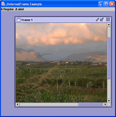
The JInternalFrame class allows you to create an application where you
have windows within the main application. You may have seen this in applications like Adobe PhotoShop.
To use JInternalFrame objects are added to a JDesktopPane,
which is like a blank panel that contains the internal windows. Internal Frames are not windows, so they
do not generate window events. They can be minimised to an icon within the desktop pane.
The constructors for JInternalFrame are:
JInternalFrame()Creates a non-resizable, non-closable, non-maximizable, non-iconifiable JInternalFrame with no title.JInternalFrame(String title)Creates a non-resizable, non-closable, non-maximizable, non-iconifiable JInternalFrame with the specified title.JInternalFrame(String title, boolean resizable)Creates a non-closable, non-maximizable, non-iconifiable JInternalFrame with the specified title and resizability.JInternalFrame(String title, boolean resizable, boolean closable)Creates a non-maximizable, non-iconifiable JInternalFrame with the specified title, resizability, and closability.JInternalFrame(String title, boolean resizable, boolean closable, boolean maximizable)Creates a non-iconifiable JInternalFrame with the specified title, resizability, closability, and maximizability.JInternalFrame(String title, boolean resizable, boolean closable, boolean maximizable, boolean iconifiable)Creates a JInternalFrame with the specified title, resizability, closability, maximizability, and iconifiability.
Figure 12.18, “The JInternalFrame Example” shows an example of the JInternalFrame
in action. The full code for this example is below and in
JInternalFrameExample.java.
 1
 2
 3   // Swing JInternal Frame Example - Derek Molloy
 4
 5   import javax.swing.*;
 6   import java.awt.*;
 7
 8   public class JInternalFrameExample extends JFrame
 9   {
10
11     public JInternalFrameExample()
12     {
13       super("JInternalFrame Example");
14       JDesktopPane desktop = new JDesktopPane();
15
16       this.getContentPane().add("North",
17                               new JLabel("A Regular JLabel"));
18       this.getContentPane().add("Center", desktop);
19
20       JInternalFrame internal1 = new JInternalFrame("Frame 1",
21                                      true, true, true, true);
22       internal1.setSize(300,300);
23       internal1.show();
24       Image testImage = this.getToolkit().getImage("test.jpg");
25       internal1.getContentPane().add(new JScrollPane(new
26               JLabel(new ImageIcon(testImage))));
27       internal1.setLocation(50,50);
28       desktop.add(internal1);
29
30       this.setSize(400,400);    // set the size to 400 x 400
31       this.show();              // display the frame
32       }
33
34     public static void main(String[] args)
35     {
36       new JInternalFrameExample();
37     }
38   }
39
40
In this example the JFrame has a regular JLabel added to
the "North" and the JDesktopPane added to the "Center". The
JDesktopPane object is the container for the JInternalFrame
objects. In this case there is only one JInternalFrame called

internal1. In the creation of the JInternalFrame the title
was set as "Frame 1" and it was set allowed to be resizable, closable, maximizable and iconifiable (yes
that is a real word!). The size was set at 300 x 300 using the setSize() method and then
the show() method was called to make the internal frame visible. The
show() method must be called to show the internal frames. A Image
object is created and added to an ImageIcon object, which is in turn added to a
JLabel and then this is added to a JScrollPane container. The
location of the internal frame is set at (50,50) using the setLocation() method and
finally the JInternalFrame object is added to the JDesktopPane
container.
The full code for this example is here -
JTabbedPaneExample.java. This
application assumes an image in the same directory called test.jpg - You can use
this one if you wish test.jpg (as with all
files you can right-click and choose "Save Target As..")
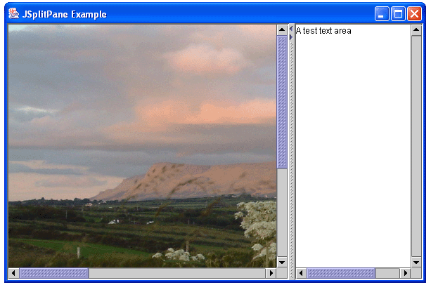
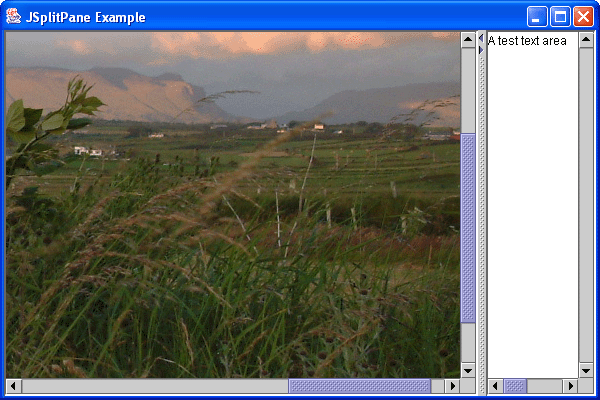
The JSplitPane class allows two components to be added to the split pane with a
divider between them. The divider can be dragged left and right, if a horizontal split is used and top and
bottom if a vertical split is used. You should really use JScrollPane containers around
the JPanel or component that you use, as when you move the split in the split pane
the container will not be completely visible. Figure 12.19, “The JSplitPane Example Application. Split (a) centre right (b) more right of centre.” displays a
JSplitPane container in action, where (a) and (b) show the split moved from left to
right (note that the scrollbars move the container correctly). If you require more than two panes in the
JSplitPane container, you can nest a JSplitPane container within
another JSplitPane container.
Here is the code for the example in Figure 12.19, “The JSplitPane Example Application. Split (a) centre right (b) more right of centre.”, as below and as in
JSplitPaneExample.java.
 1
 2
 3   // Swing JSplitPane Example - Derek Molloy
 4
 5   import javax.swing.*;
 6   import java.awt.*;
 7
 8   public class JSplitPaneExample extends JFrame
 9   {
10
11     public JSplitPaneExample()
12     {
13       super("JSplitPane Example");
14
15       JScrollPane pane2 = new JScrollPane(
16               new JTextArea("A test text area",20,20),
17               JScrollPane.VERTICAL_SCROLLBAR_ALWAYS,
18               JScrollPane.HORIZONTAL_SCROLLBAR_ALWAYS);
19
20       JScrollPane pane1 = new JScrollPane(
21               new JLabel(new ImageIcon("test.jpg")),
22               JScrollPane.VERTICAL_SCROLLBAR_ALWAYS,
23               JScrollPane.HORIZONTAL_SCROLLBAR_ALWAYS);
24
25       JSplitPane splitPane = new JSplitPane(JSplitPane.HORIZONTAL_SPLIT,
26               pane1, pane2);
27       splitPane.setOneTouchExpandable(true);
28       splitPane.setDividerLocation(400);
29
30       this.getContentPane().add("Center", splitPane);
31       this.setSize(600,400);
32       this.show();
33     }
34
35     public static void main(String[] args)
36     {
37       new JSplitPaneExample();
38     }
39   }
40
41
In this example two JScrollPane objects are added to the JSplitPane
using the constructor of the object:
JSplitPane(int newOrientation, Component newLeftComponent, Component newRightComponent)Creates a new JSplitPane with the specified orientation and with the specified components that do not do continuous redrawing.
where JSplitPane.HORIZONTAL_SPLIT defines the orientation and next two objects are the
JScrollPane components. When the setOneTouchExpandable() is passed
a value of true then the divider displays two little arrows, when pressed on fully expand
the left of right pane (you can see these arrows in Figure 12.19, “The JSplitPane Example Application. Split (a) centre right (b) more right of centre.” at the top of the
divider). The divider location can be placed using the setDividerLocation().
There are other methods that are useful for the JSplitPane
setDividerSize(int) - Sets the width of the divider.
resetToPreferredSize() - Sets the size of the split pane based
on the preferred size of the added components.
setResizeWeight(double) - Sets how the scroll pane should react when
it is resized. A value of 0 specifies the right component gets all the new space, 1 specifies the left
component gets all the new space - 0.5 gives both sides equal new space.
setRightComponent() - Allows you to specify a new component for
the right hand side. setLeftComponent() allow you to specify a new component
for the left hand side.
© 2006
Dr. Derek Molloy (DCU).
| |  | |
| Other Useful Swing Components |  | Dialogs and More Components |